NOTE! This piece is not an original composition. It's taken directly from the tutorial in the POV-Ray documentation. I included it because it's neat, and because it was one of the major factors influencing me to continue working with POV-Ray. I created it myself - except that every step was covered in the tutorial.
This thumbnail really doesn't do justice to it - the reflections of the metallic teepees are really neat.
Click for a 512x384 pic (108k)
Looking back, this seems incredibly simplistic, but at the time it was a major accomplishment for me. It was the first creative thing I did in POV-Ray, the first deviation from the tutorial given. Only a small version is available - it's not very detailed anyway.
Click for a 320x240 pic (30k)
This is the first piece I'm actually proud of. I was experimenting with Bezier patches in Moray, and created this funny-looking shape. Later I read about animation, and realized that it was possible to animate a Bezier patch. The animation code was done manually, by comparing two different versions of the Bezier patch, one open and one closed. There's also a little bit of animation with the lights. A larger version is available at each of the three stages of the animation, (thumbnail of the first stage is shown) and the animation itself is also available.
Click for a 512x384 pic (50k)
and more choices.
This is an interesting little piece I created while playing with texture settings. It probably doesn't look all that remarkable from here, but the alpha blending effect is quite interesting in the closeup. (and hey, it's only 25k, go for it. :)
Click for a 512x384 pic (25k)
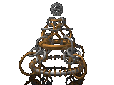
This is another experiment in textures, but it is a unique one for a very important reason. It was the first one that I used Moray with. Moray is a modeller for POV-Ray. It is the equivalent of drawing something out as a blueprint and making lots of changes, rather than building the whole thing each time. Moray lets you move things around in real-time (albeit as wire-frames) and position them visually instead of just numerically. A link from the larger version of this allows you to see a Moray screenshot.
Click for a 512x384 pic (53k)
and the Moray screenshot
Date: about 6/20/97
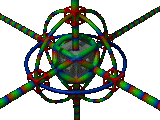
I consider this one of my masterpieces. It was composed in Moray, and consists of 61 torii arranged in 4-way symmetry. Each torus is either gold or silver, and is reflective. (Look at the large gold torus at the center - it shows some good reflections) Also of note is the reflective, solid black, base. It's hard to see these reflections even at 512x384, so a 1024x768 version is available also. It's XXXk, but you can see a lot of detail. Still not as much as the 1600x1200 copy I use for my wallpaper, but you'll have to come over to see that one - it's 5 meg. :)
Click for a 512x384 pic (41k)
and other options
Well, this was originally going to be a very neat picture, but it's currently under construction. It consists of the letters JEREMY (that would be my name) made out of various cylinders and sections of torii, against a checkered background. If all had gone as planned, the letters would look like glass tubing, and would distort the checkered background in all kinds of interesting ways. However, I haven't gotten the glass version to look very good due to spaces between sections of each letter. It doesn't show in this metallic version, but the glass version has dark lines wherever it changes from one primitive to another. :( A large version is available, though it isn't all that interesting. (unless your name is Jeremy :) It will be when I get it to look good in glass, I promise. :)
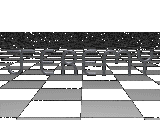
Click for a 512x384 pic (26k)
and other options